MIST
Magnetosphere, Ionosphere and Solar-Terrestrial
Small Changes to Improve the Accessibility of Your Science
By Michaela K. Mooney, Divya M. Persaud, George Brydon, and Jasmine K. Sandhu
Michaela, Divya, and George are fourth year PhD students at the Mullard Space Science Laboratory (UCL). Michaela studies Earth’s magnetosphere and auroral dynamics, Divya studies planetary geology on Mars using 3D imagery, and George studies techniques and hardware for planetary imaging. Jasmine is a senior research associate at Northumbria University researching inner magnetospheric dynamics.
The key methods we use to communicate our science are presentations, posters and social media. Ensuring that the content we are presenting is accessible to everyone in our audience will increase the impact. We provide some easy tips that we can all implement to make our content more accessible to a wider audience. Although these are just some really simple and easy changes that you can make, there is always more that we can learn - check if your institution offers any training courses for you!
Improve your slides
Many of the ways we can make presentation slides more accessible are generally good practise anyway and can vastly improve the overall quality of a presentation. A really useful guide to designing your presentation slides can be found here. Some key points to remember are:
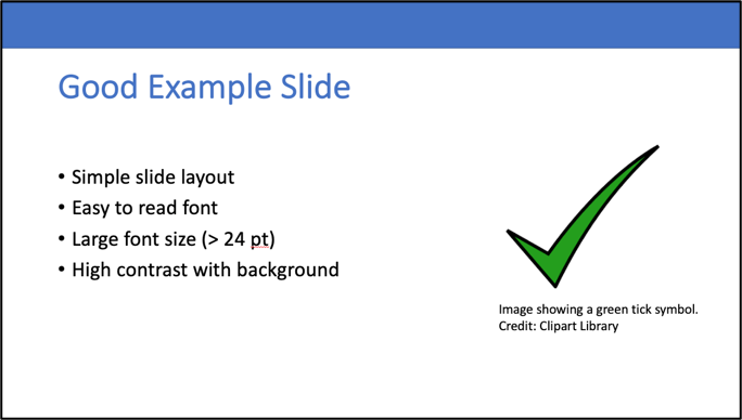
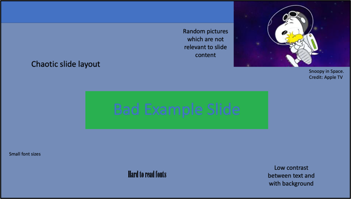
- Keep slides simple, use limited spaced out text with one figure or diagram.
- Use plain light backgrounds and dark contrasting text.
- Use plain, large font sizes (> 24 pt font) that can easily be seen from the back of the room or from a small laptop screen. This includes text on your figures too, such as axis labels!
- Take your time to describe and explain all content on your slides, and avoid rushing through slides.
Figures 1 and 2 below show examples of a good and bad presentation slide layouts.

Figure 1. An example of an accessible presentation slide.

Figure 2. An example of an inaccessible presentation slide.
Use captions during presentations
Captions are a simple additional tool we can use which vastly improve accessibility during a talk. Captions are very useful for people who are hard-of-hearing but they can also be useful for audience members who are not native language speakers, and those with dyslexia. For example, a study on student learning reported that more than 90% of students found captions helpful in supporting their learning. Captions are not always perfect, particularly if you have an accent, but they will catch the majority of what you are saying.
PowerPoint, Google Slides, Zoom and Teams all have built-in captions functionality. Click on each platform to learn more about how to use the caption functionalities. Captions in Zoom can also be saved to produce a transcript at the end of a meeting.
If you are using videos in a presentation, try to use videos with captions and audio description. Giving a brief explanation to what the video will show before playing the video helps to provide context to people with visual impairments.
Use colour-blind friendly palettes
Plots, diagrams and figures are the most common tools we use to communicate complex science ideas. Use colour-blind friendly colours to make sure that your figures are accessible to everyone. It’s estimated that around 1 in 12 men and 1 in 200 women have some degree of colour-blindness (see NHS report here), so it’s very likely that these changes will benefit someone in your audience! Spectral or rainbow colour maps are commonly used in science, however they are not accessible to any type of colour-blindness [Crameri et al., 2020]. Additionally, our eyes do not respond to all of the colours within these maps equally, making it difficult to interpret the true nature of the data they represent (this is true for people with and without colour-vision deficiency). Instead, use colour maps which are perceptually uniform, meaning that colours are evenly distributed to form a linear colour gradient. Commonly used perceptually uniform colour maps include ‘viridis’ and ‘cividis’.
Different colours should also have a high contrast, so that they can be easily distinguished. There are plenty of resources online to help you find a suitable colour scheme, such as ColorBrewer and Coolors. You can check whether your colour scheme and content is suitable using a colour-blind simulator of filter (e.g. the Coblis simulator or the Paciello colour contrast checker). It’s also good practice to consider using additional ways to differentiate information, for example using different textures, line styles and annotations. An example of this is shown below in Figure 3, where the use of line styles, symbols, and a legend are essential for those with different forms of colour-blindness (panels b-d) to differentiate between the lines.

Figure 3. An example plot, as shown by those with (a) normal vision and (b-d) forms of colour-blindness.
Social media
Lots of us use social media to promote our work, posting interesting plots, pictures of us giving conference or outreach presentations or highlighting a new publication.
When posting videos on social media try to include captions if possible and if posting plots or images, many platforms such as Twitter provide image description functions which can be used to describe the image (find out how to do that here).
This is by no means an exhaustive list of accessibility tips. It’s important to recognise that accessibility can mean very different things for different people, and this means that the way that we adapt our approaches can also vary. If you are arranging an outreach event, conference or meeting, do some research around accessibility and consider the accessibility of the venue. Encourage presenters and speakers to also be mindful of accessibility requirements. Creating accessible content is hugely important for outreach events as inaccessible content will actively exclude members of the audience. For open participation events, you may not be aware of specific accessibility requirements ahead of time.
Thanks for reading! We’ve listed some helpful resources below:
- https://blog.ucsusa.org/science-blogger/how-to-make-professional-conferences-more-accessible-for-disabled-people-guidance-from-actual-disabled-scientists
- https://www.washington.edu/doit/how-can-you-make-your-presentation-accessible
- https://www.w3.org/WAI/teach-advocate/accessible-presentations/
- https://webaim.org/articles/visual/colorblind
EDIT: Additional Links from the Community
- ColorOracle - a handy software app to easily simulate different colour vision types
- British Dyslexia Associations style guide - useful & practical guidance on e.g. font specifications and backgrounds
If you have additions to this list then please let us know by emailing us at This email address is being protected from spambots. You need JavaScript enabled to view it.!
