MIST
Magnetosphere, Ionosphere and Solar-Terrestrial
Latest articles
- Temporal Variability of Saturn's H2 Dayglow and Northern Aurora Observed by Hisaki and Cassini
- The Jupiter Auroral Ionosphere Code
- Analysis of Chorus Wave Power on Burst‐Mode Timescales During the Van Allen Probes Era
- Soft X-Ray Emission from Saturn's Magnetosheath II: Solar Wind Driving
- Which Kelvin-Helmholtz waves grow along the spatially-varying magnetopause flanks and why?
Latest news
Open Letter Ready For Signatories
Protect MIST Science! Sign the MIST Community Open Letter on the STFC funding cuts!
https://sites.google.com/view/uk-mist-community-open-letter
Statement from MIST Council regarding the STFC Funding Situation
Statement from MIST Council regarding the STFC Funding Situation
MIST Council is deeply concerned by the ongoing STFC funding uncertainty and its impact on our community and beyond.
The current combination of prospective delayed and reduced funding, together with already volatile financial situations at universities across the UK, is placing significant strain on research groups. In some cases, institutions may be unable to support researchers through gaps between projects, increasing precarity across the community and adding significant pressure on early-career researchers.
We are concerned that continued uncertainty risks accelerating a brain drain from the UK, as skilled researchers reconsider their future in a system offering limited stability. The loss of expertise at any career stage would have lasting consequences for UK space science.
What is going on?
For those that are unaware of the situation, it is complex and evolving. We suggest the following sources to get up to speed on the current developments.
https://ras.ac.uk/news-and-press/news/proposed-budget-cuts-catastrophe-uk-astronomy
What are we doing about it?
Behind the scenes, MIST Council is actively engaging with relevant parties to understand the scale of the challenge and to identify constructive ways forward.
- We are seeking seasoned members of the community to join MIST Council on a task force to help develop options and represent the needs of our community. If you would like to be involved, please reach out to us via the MIST Council email (This email address is being protected from spambots. You need JavaScript enabled to view it.) by the end of this week (13th February 2026).
- In addition to the task force, we want to provide an open forum for discussion and collective input among all members of the wider MIST community. We are exploring options and will be in touch as soon as possible with further details.
- We believe in working together in the face of the current challenges and we are collaborating with UKSP and others to strive for a fair and positive outcome for all. We are reaching out to members of the SSAP (Solar System Advisory Panel) to explore the hosting of a community town hall meeting, like the one already being organised by the AAP (Astronomy Advisory Panel), to provide an open forum for discussion and collective input.
What can you do to help?
There are several open letters representing people in various career stages that have been made available to sign. We encourage you to read the relevant letter(s) and to sign them if you support them:
- Fellowship Holders: https://advancedfellows-openletter-stfc.github.io/index.html
- Early Career Researchers: https://ecr-openletter-stfc.github.io/
The Royal Astronomical Society are also urging Fellows to lobby their MPs against the cuts, and have included a template letter that can be used to do so:
https://ras.ac.uk/news-and-press/news/ras-fellows-urged-lobby-against-unprecedented-cuts
MIST Council will continue to advocate for transparency, stability, and funding structures that recognise both the long-term nature of our science and the people who deliver it.
We thank you for your continued support in this period of uncertainty.
Please contact This email address is being protected from spambots. You need JavaScript enabled to view it. if you have further suggestions.
MIST Council
![]()
Announcement of New MIST Council 2025
We are very pleased to announce the following members of the community have been elected to MIST Council:
- Gemma Bower (University of Leicester), MIST Councillor
- Tom Elsden (University of St Andrews), MIST Councillor
- Cameron Patterson (Lancaster University), MIST Councillor
- Fiona Ball (University of Southampton), Student Representative
They will begin their terms in July 2025.
We thank outgoing MIST Council members: Maria Walach, Chiara Lazzeri and Emma Woodfield. Andy Smith will remain on council a little longer as a co-opted member to cover Rosie Johnson's maternity leave.
The current composition of Council can be found on our website (https://www.mist.ac.uk/community/mist-council).
Announcement of New MIST Councillors.
We are very pleased to announce the following members of the community have been elected unopposed to MIST Council:
- Rosie Johnson (Aberystwyth University), MIST Councillor
- Matthew Brown (University of Birmingham), MIST Councillor
- Chiara Lazzeri (MSSL, UCL), Student Representative
Rosie, Matthew, and Chiara will begin their terms in July. This will coincide with Jasmine Kaur Sandhu, Beatriz Sanchez-Cano, and Sophie Maguire outgoing as Councillors.
The current composition of Council can be found on our website, and this will be amended in July to reflect this announcement (https://www.mist.ac.uk/community/mist-council).
Nominations are open for MIST Council
We are very pleased to open nominations for MIST Council. There are three positions available (detailed below), and elected candidates would join Georgios Nicolaou, Andy Smith, Maria-Theresia Walach, and Emma Woodfield on Council. The nomination deadline is Friday 31 May.
Council positions open for nomination
2 x MIST Councillor - a three year term (2024 - 2027). Everyone is eligible.
MIST Student Representative - a one year term (2024 - 2025). Only PhD students are eligible. See below for further details.
About being on MIST Council
If you would like to find out more about being on Council and what it can involve, please feel free to email any of us (email contacts below) with any of your informal enquiries! You can also find out more about MIST activities at mist.ac.uk. Two of our outgoing councillors, Beatriz and Sophie, have summarised their experiences being on MIST Council below.
Beatriz Sanchez-Cano (MIST Councillor):
"Being part of the MIST council for the last 3 years has been a great experience personally and professionally, in which I had the opportunity to know better our community and gain a larger perspective of the matters that are important for the MIST science progress in the UK. During this time, I’ve participated in a number of activities and discussions, such as organising the monthly MIST seminars, Autumn MIST meetings, writing A&G articles, and more importantly, being there to support and advise our colleagues in cases of need together with the wonderful council members. MIST is a vibrant and growing community, and the council is a faithful reflection of it."
Sophie Maguire (MIST Student Representative):
"Being the student representative for MIST council has been an amazing experience. I have been part of organizing conferences, chairing sessions, and writing grant applications based on the feedback MIST has received. From a wider perspective, MIST has helped to grow and support my professional networks which in turn, directly benefits my PhD work as well. I would encourage any PhD student to apply for the role of MIST Student Representative and I would be happy to answer any questions or queries you have about the role."
How to nominate
If you would like to stand for election or you are nominating someone else (with their agreement!) please email This email address is being protected from spambots. You need JavaScript enabled to view it. by Friday 31 May. If there is a surplus of nominations for a role, then an online vote will be carried out with the community. Please include the following details in the nomination:
- Name
- Position (Councillor/Student Rep.)
- Nomination Statement (150 words max including a bit about the nominee and focusing on your reasons for nominating. This will be circulated to the community in the event of a vote.)
MIST Council details
- Sophie Maguire, University of Birmingham, Earth's ionosphere - This email address is being protected from spambots. You need JavaScript enabled to view it.
- Georgios Nicolaou, MSSL, solar wind plasma - This email address is being protected from spambots. You need JavaScript enabled to view it.
- Beatriz Sanchez-Cano, University of Leicester, Mars plasma - This email address is being protected from spambots. You need JavaScript enabled to view it.
- Jasmine Kaur Sandhu, University of Leicester, Earth’s inner magnetosphere - This email address is being protected from spambots. You need JavaScript enabled to view it.
- Andy Smith, Northumbria University, Space Weather - This email address is being protected from spambots. You need JavaScript enabled to view it.
- Maria-Theresia Walach, Lancaster University, Earth’s ionosphere - This email address is being protected from spambots. You need JavaScript enabled to view it.
- Emma Woodfield, British Antarctic Survey, radiation belts - This email address is being protected from spambots. You need JavaScript enabled to view it.
- MIST Council email - This email address is being protected from spambots. You need JavaScript enabled to view it.
Nuggets of MIST science, summarising recent papers from the UK MIST community in a bitesize format.
If you would like to submit a nugget, please fill in the following form: https://forms.gle/Pn3mL73kHLn4VEZ66 and we will arrange a slot for you in the schedule. Nuggets should be 100–300 words long and include a figure/animation. Please get in touch!
If you have any issues with the form, please contact This email address is being protected from spambots. You need JavaScript enabled to view it..
The closest-to-the-Sun-ever direct observation of a shock wave and its heliospheric journey
By Domenico Trotta (Imperial College London)
Shock waves, i.e., abrupt transitions between supersonic and subsonic flows, are present in a large variety of astrophysical systems, and are pivotal for efficient energy conversion and particle acceleration in our universe [1]. Despite decades of research, the mechanisms by which particles are accelerated at shocks are a matter of debate, and are crucial to several applications, ranging from explaining acceleration of cosmic rays to the highest energies [2] to the study of space weather phenomena [3].
Shocks in the heliosphere are unique, being directly accessible by spacecraft exploration, thus providing the missing link to the remote observations of astrophysical systems. Interplanetary (IP) shocks are generated because of solar activity phenomena, such as Coronal Mass Ejections (CMEs), and play an important role in the energetics of the heliosphere where they propagate [4].
The ground-breaking NASA Parker Solar Probe (PSP, [5]) and ESA Solar Orbiter [6] missions are probing the previously unexplored inner heliosphere, providing datasets with unprecedented resolutions.
We used such novel observational window to report direct PSP observations of a CME-driven shock as close to the Sun as 0.07 A, making it the closest to the Sun direct observation of a shock wave to date. The shock then reached Solar Orbiter at 0.7 AU, enabling us to study the evolution of the shock throughout its propagation in the heliosphere.
We characterized the shock and its environment. At PSP, we found a sharp shock with moderate strength, and investigated how switchbacks, fundamental constituents of the near-Sun environment, are processed by the shock crossing. In contrast, the Solar Orbiter observations revealed a very structured shock transition, with shock-accelerated protons with energies of up to 2 MeV. The differences between the two shocks are due to both evolution effects and the large-scale geometry of the event, crossed by the spacecraft in two points only. This study elucidates how the local features of IP shocks and their environments can be very different as they propagate through the heliosphere.
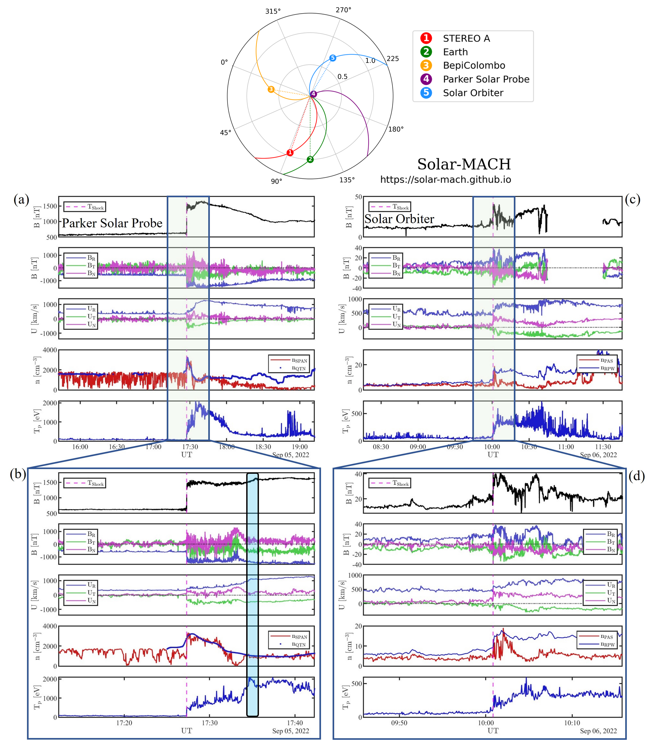
See full publication for further information:
Trotta et al., ApJ, 962, 2 (2024), DOI: 10.3847/1538-4357/ad187d
References:
[1] Bykov et al., SSRv, 2015, 14 (2019)
[2] Amato&Blasi, Adv. Sp. Res., 62, 10 (2018)
[3] Klein&Dalla, SSRv, 212, 1107 (2017)
[4] Reames et al., ApJ, 483, 512 (1997)
[5] Fox et al., SSRv, 204, 7 (2016)
[6] Muller et al., A&A, 642, A1 (2020)
The Impact of Non-Equilibrium Plasma Distributions on Solar Wind Measurements by Vigil's Plasma Analyser
Hongjie Zhang (University College London)
Space weather, originating from the Sun, has a profound impact on human life. An effective space weather monitor is crucial for detecting severe space weather events and providing early warnings before they reach Earth. The European Space Agency is currently preparing to launch the Vigil mission as a space-weather monitor at the fifth Lagrange point of the Sun-Earth system. Vigil will carry, amongst other instruments, the Plasma Analyser (PLA) to provide quasi-continuous measurements of solar wind ions.
In this study, we model the performance of the PLA instrument. We employ a forward-modeling technique, which involves predicting measurements (number of particle counts in energy, elevation, and azimuth) based on typical solar wind properties. Then we utilize backward-modeling based on the predicted measurements. This approach allows us to compare the expected observations of the PLA with the assumed input conditions of the solar wind. We evaluate the instrument performance under realistic, non-equilibrium plasma conditions, accounting for temperature anisotropies, proton beams, and the contributions from alpha-particles. We examine the accuracy of the instrument’s performance over a range of input solar wind properties. We recommend potential improvements such as applying ground-based fitting techniques to obtain more accurate measurements of the solar wind even under non-equilibrium plasma conditions. The use of ground processing of plasma moments instead of on-board processing is crucial for the extraction of reliable measurements.
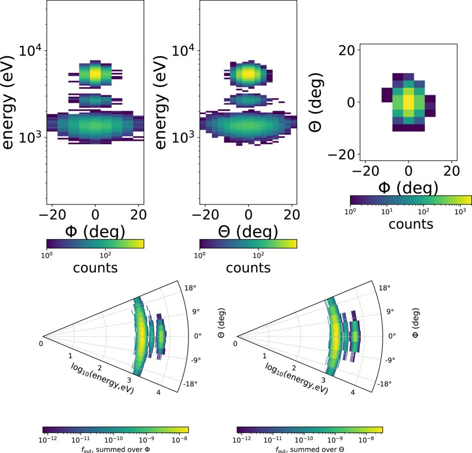
See publication for details:
Zhang, H., Verscharen, D., & Nicolaou, G. (2024). The impact of non-equilibrium plasma distributions on solar wind measurements by Vigil's Plasma Analyser. Space Weather, 22, e2023SW003671. https://doi.org/10.1029/2023SW003671
The challenge to understand the zoo of particle transport regimes during resonant wave-particle interactions for given survey-mode wave spectra
By Oliver Allanson (University of Birmingham; University of Exeter)
Quasilinear theories have been shown to well describe a range of transport phenomena in magnetospheric, space, astrophysical and laboratory plasma “weak turbulence” scenarios. It is well known that the resonant diffusion quasilinear theory for the case of a uniform background field may formally describe particle dynamics when the electromagnetic wave amplitude and growth rates are sufficiently “small”, and the bandwidth is sufficiently “large”.
However, it is important to note that for a given wave spectrum that would be expected to give rise to quasilinear transport, the theory may apply for a given range of resonant pitch-angles and energies, but may not apply for some smaller, or larger, values of resonant pitch-angle and energy. That is to say that the applicability of the quasilinear theory can be pitch-angle dependent, even in the case of a uniform background magnetic field. If indeed the quasilinear theory does apply, the motion of particles with different pitch-angles are still characterised by different timescales.
Using a high-performance test-particle code, we present a detailed analysis of the applicability of quasilinear theory to a range of different wave spectra that would otherwise “appear quasilinear” if presented by e.g., satellite survey mode data. We present these analyses as a function of wave amplitude, wave coherence and resonant particle velocities (energies and pitch-angles). In doing so, we identify and classify five different transport regimes (see figure) that are a function of particle pitch-angle.
The results in our paper demonstrate that there can be a significant variety of particle responses (as a function of pitch angle) for very similar looking survey-mode electromagnetic wave products, even if they appear to satisfy all appropriate quasilinear criteria.
In recent years there have been a sequence of very interesting and important results in this domain, and we argue in favour of continuing efforts on: (i) the development of new transport theories to understand the importance of these, and other, diverse electron responses; (ii) which are informed by statistical analyses of the relationship between burst- and survey-mode spacecraft data.
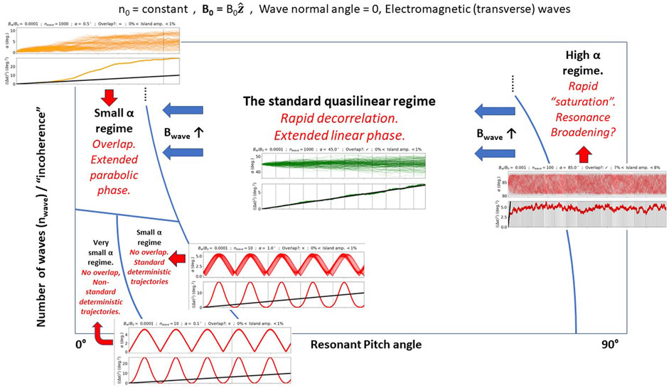
For full details see https://doi.org/10.3389/fspas.2024.1332931
SpaceSSL – Automatic Encoding to Find Similar Observations
By Andy Smith (Northumbria University)
We often have large, unlabelled datasets in space physics, where the phenomenon of interest only appears rarely. Understanding the underlying physics of the system from rare observations is a challenge, and locating complementary, similar observations in large datasets can be prohibitively time consuming.
In this work we present an automated, self-supervised method by which the key information from two dimensional data can be encoded into a smaller vector representation. This representation (encoding/embedding) contains the key information describing the data; we can then use the distance between vectors to assess the similarity of the observations.
We showed the potential of this method with two example datasets – spacecraft in situ electron velocity distributions and auroral all sky images. For both datasets we provided the method with a library of over five thousand images, which were then effectively and automatically summarized by the model.
In the case of the electron distributions, we tested a “seed” image of a rare phenomena – corresponding to the region of space near the site of magnetic reconnection. In this region the electron distribution takes a characteristic crescent or arc-like shape [Figure 1, centre]. We can then extract the six closest partners of this image, using the distance between the embedding vectors. The two closest neighbours of the seed image (A and B in Figure 1) represent two separate previously published case study examples known to be close to the site of magnetic reconnection.
This method promises to be a useful tool in locating interesting phenomena in large datasets, providing an efficient method for moving from case studies to thorough statistical surveys. Code to train an example model is available at: https://github.com/SmithAndy005/SpaceSSL .
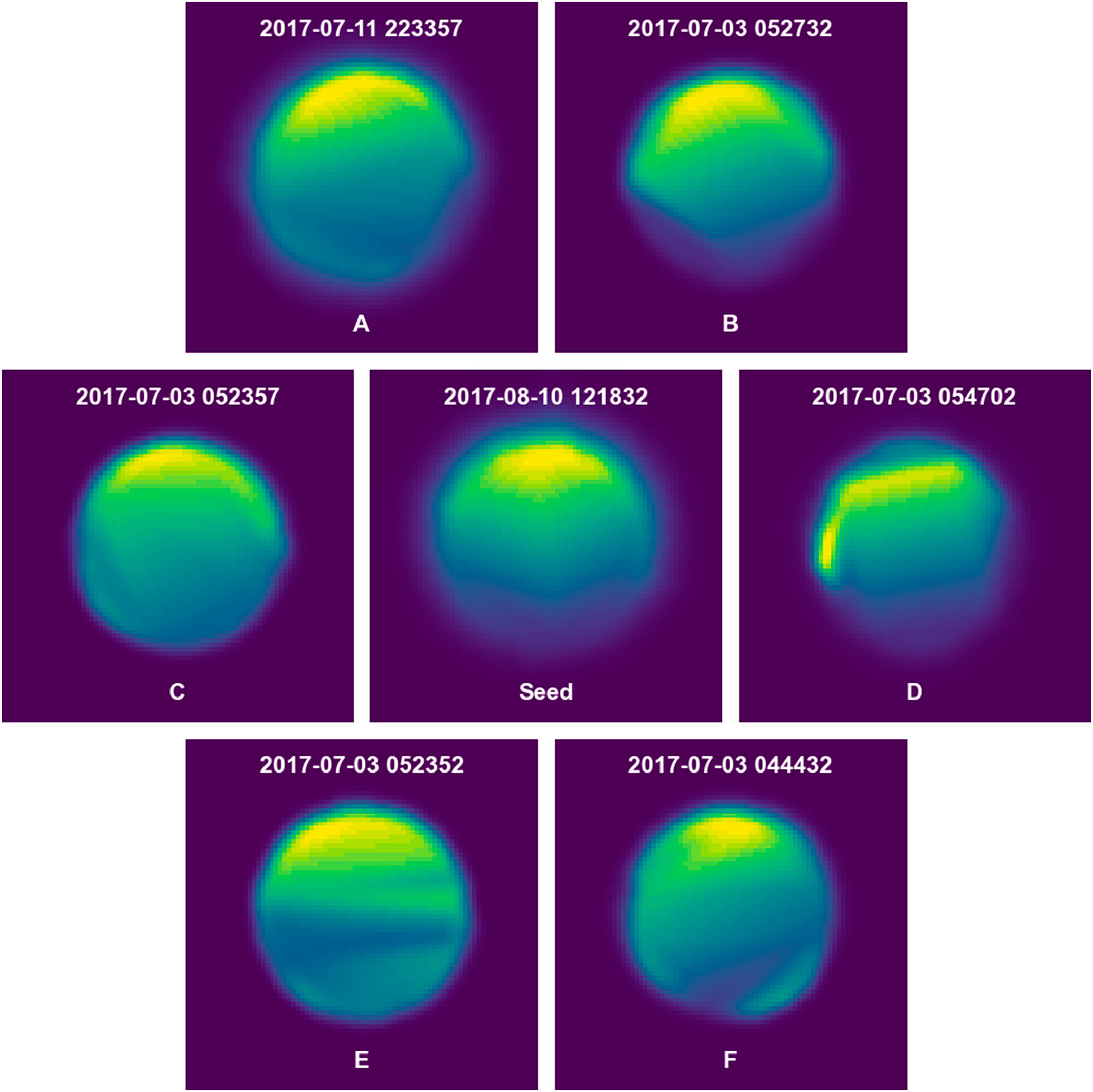
See publication for details:
Smith, A. W., Rae, I. J., Stawarz, J. E., Sun, W. J., Bentley, S., & Koul, A. (2024). Automatic encoding of unlabeled two dimensional data enabling similarity searches: Electron diffusion regions and auroral arcs. Journal of Geophysical Research: Space Physics, 129, e2023JA032096. https://doi.org/10.1029/2023JA032096
The Nonlinear Evolution of Whistler-Mode Chorus waves: How Modulation Instabilities Can Be a Route to Tone Formation
By Daniel Ratliff (Northumbria University)
Whistler-Mode Chorus (WMC) waves remain a key contributor to the processes underpinning space weather modelling and have garnered considerable interest for their unique frequency properties (known as tones, where the frequency will rise or fall coherently). This role and phenomena are in no small part due to the interplay between these waves and the electrons present in the magnetosphere. At present, these wave particle interactions are difficult to model simultaneously effectively, and we normally restrict ourselves to the effect of one on the other – either a known wave is used to develop a particle distribution, or a supplied particle distribution generates WMC waves. Can we develop models that do both? And furthermore, can we develop a model that can reproduce this interesting set of frequency dynamics?
In our paper, we use formal perturbation techniques to derive a reduced, nonlinear model for (parallel propagating) WMC that is driven by wave-particle interactions via ponderomotive effects. Our first attempt, the famous Nonlinear Schrodinger equation, fails to generate tones – and so we dig a little deeper to find a term responsive for nonlinear frequency shifts. Surprisingly, this new term responsible for tones vanishes precisely at the WMC band gap at half the electron gyrofrequency, and provides a theoretical basis for why such a bandgap exists. By exploring this model numerically, we also find that there are cases where this tonal behaviour comes with a significant enhancement of the electron kinetic energy – so maybe the magnetosphere’s dawn chorus is at times a swan song in disguise?
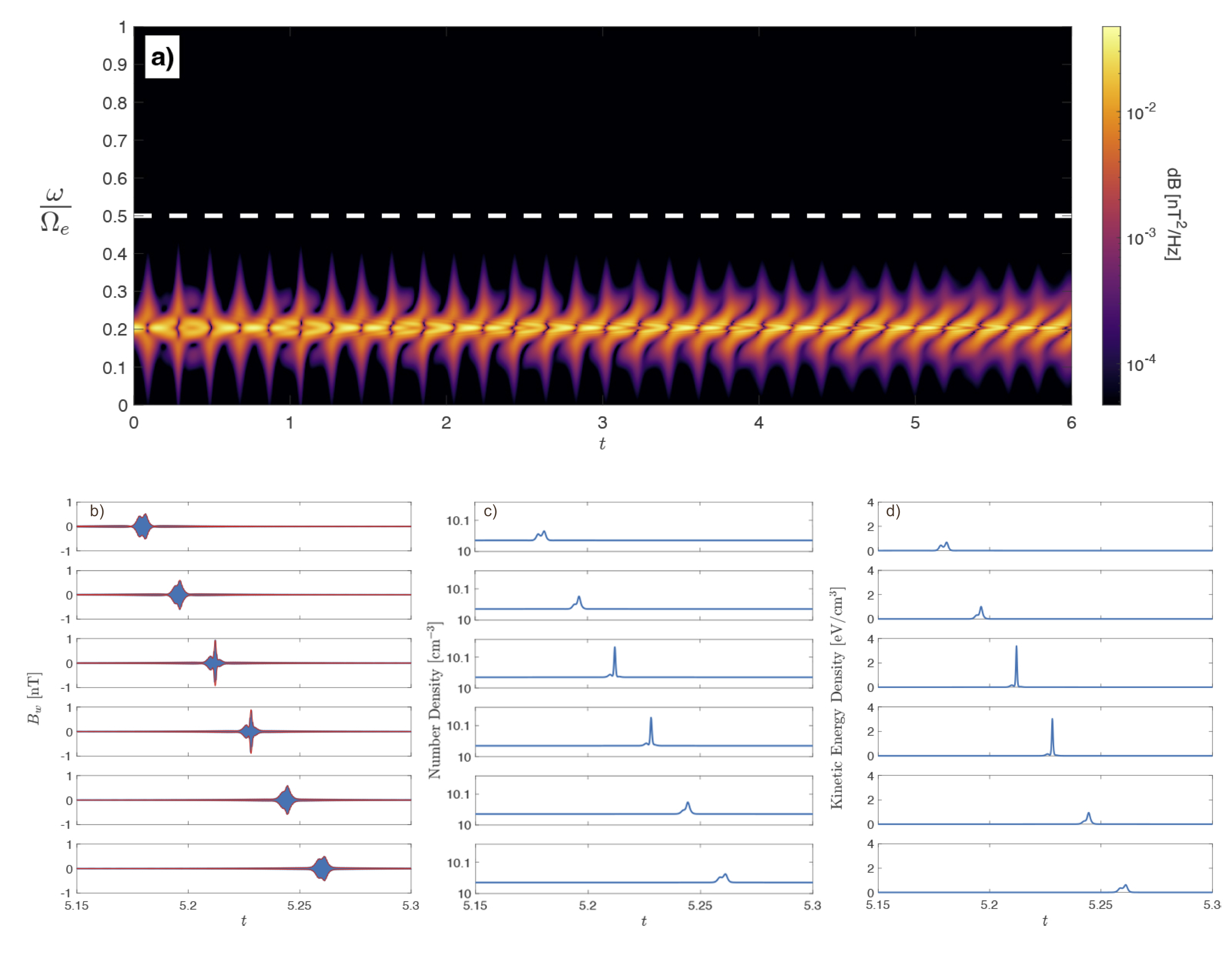
See publication for further information:
Ratliff DJ, Allanson O. The nonlinear evolution of whistler-mode chorus: modulation instability as the source of tones. Journal of Plasma Physics. 2023;89(6):905890607. doi:10.1017/S0022377823001265